Freez Product:
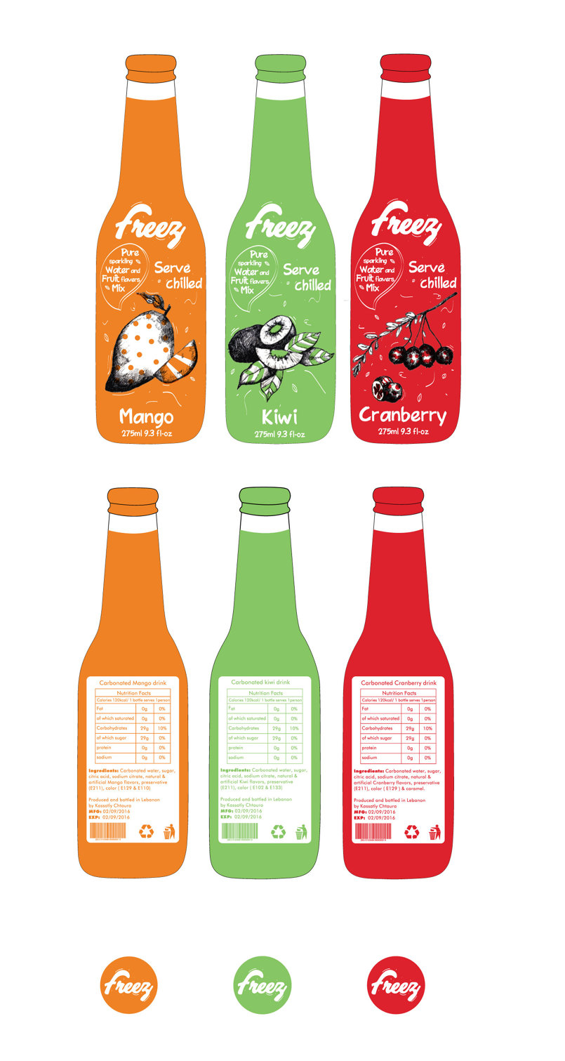
I worked on Freez bottle design. I lifted the logo to give it new look. I did a new illustrations by hand for the fruit, then mix it with typography to create more attractive design, especially my illustrations are in black and white to create a big contrast with the background color. This way it will be more eye catching on the shelf since the concept of my design is completely different than the designs we have on shelf. It is modern and unique. Target audience are mainly teenagers and adults from both genders. I worked on 3 flavors, which are Mango, kiwi and Cranberry to present my concept design clearly. The color of each fruit will cover the whole bottle to make contrast with black and white illustration.The bottle caps contain the logo on it. I used 2 fonts which are. "Fatura book BT" for product information (nutrition facts, ingredients, EXP & MFG, and where it is produced) since it is readable. "PWBrusheez" is to go with the design since the strokes are brushed so the typography
is brushed as well.
اشترك معنا أو قم بـ تسجيل الدخول لكي تستطيع التعليق .


